Okay, full disclosure, I hate change or at least useless change. Skip over the rant to the HowTo fix Skype if you want.
Rant starts here…
I stayed with Windows NT 4.0 UI then Windows XP UI and now Windows 7 UI for much longer than I should because I hate useless UI changes that are introduced for the sake of change. I’m productive now and the UI changes make me less productive. Consider how long it takes to find simple options for systems administration when moving between Windows 2003, Windows 2008 R2, and Windows 2012 servers and the entire industry takes a productivity hit with each UI change introduced.
Rant ends here.
Skype recently upgraded their UI in version 7.0 to include a useless home page conversation window. It took me several iterations to figure out how to get rid of it without hacking the Skype binary.

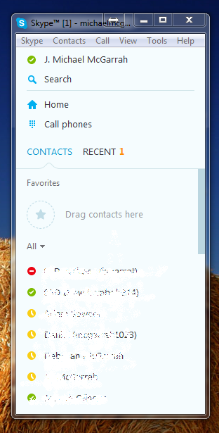
Below is the UI I’ve become accustom to using over the years in the latest Skype 7 view.

To get this view above in the recent Skype 7 update:
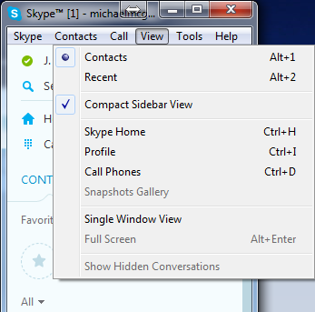
- Select View -> Contacts (Alt-1)
- Select View -> Contact Sidebar View
- Select View -> Split Window View
- Close the annoying Skype Home Page window

Here is the View settings that get me the Skype 7 UI that I’ve been using for years and like just fine. You will have to close the Skype Home window when you start up Skype but that is small price to pay.
About the Author:
Michael McGarrah is a Cloud Architect with 25+ years in enterprise infrastructure, machine learning, and system administration. He holds an M.S. in Computer Science (AI/ML) from Georgia Tech and a B.S. in Computer Science from NC State University, and is currently pursuing an Executive MBA at UNC Wilmington.
LinkedIn ·
GitHub ·
ORCID ·
Google Scholar ·
Resume